28 May 2013

Rio Branco (Acre, Brazil)

The capital city that we'll see today is Rio Branco, capital of the state of Acre. This is its flag:


It's a white background, with the arms of the Baron of Rio Branco (1845-1912), including the barony crown (!)  and his personal motto ("Ubique Patria Memor", that means "Wherever I go, my patria will be on my memory"), that's also Rio Branco municipal coat of arms, and the letterings "MUNICÍPIO DE RIO BRANCO" ("Municipality of Rio Branco") on top and "ESTADO DO ACRE" ("State of Acre") on the bottom.

From now, I think the origin of city's name is clear. The Baron of Rio Branco, son of the Viscount of Rio Branco (the longest serving prime-minister of Empire of Brazil), was a Brazilian geograph, historian and considered the "father of Brazilian diplomacy", for his work on border disputes (including the case of Acre, hence the tribute on the capitol of the state). His popularity was gigantic: his name was quoted to the presidency and, when he died, the Carnival was paralysed for mourning. Currently, his face appears on Brazilian 50 cents coins. He's also related to vexillology: he made a proposal to a new national flag.

The arms of baron of Rio Branco is a simplified version of the arms of his father (that also included a feather and a compass). It's constituted by the a golden armillary sphere of blue interior (heraldically related to Brazil) and a silver river (canting, as "rio branco" means "white river").

My proposal is a banner of arms of the municipality, identical to those of the baron:


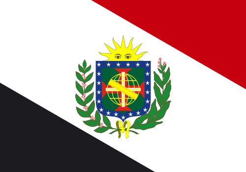
This flag has all the necessary symbolism of current flag, but it's much more direct to the point. The flag is slightly similar to the one of the Kingdom of Brazil (1815-1822), but I don't know if it's a problem at all.

Your comment is welcome!
If you want to know more about Brazilian nobility, click here.

21 May 2013

Africa

May 25th is Africa Day! On this day, Africa will commemorate the 50th anniversary (golden jubilee!) of the foundation of the Organization of African Union (OAU), currently named African Union (AU). I think it's an excellent opportunity to think a flag to represent the African pride on the continent and by African diaspora.

The continent doesn't have an official flag; the nearest you can find is the flag of the African Union, constituted by all African countries with the exception of Morocco (due to Western Sahara recognition and membership):


I think a new flag is necessary, not only because it's not an official African flag, but because it excludes Morocco. My attempt to the flag of whole Africa:


This flag comprehends the main color sets in Africa: the Pan-African red-yellow-green and red-black-green and the Pan-Arab black-green-white-red. The concentric circles, ordered from the lighter to the darker, represents the sun penetrating the darkness i.e. the peace and glory of the continent that will overcome the dark past of slavery and misery.

Your comment is welcome. Please, leave a comment.
If you see any issue regarding this flag, I'd like to be told. In the worst hypothesis, it's purely my ignorance.

14 May 2013

Brazil

Today it's time to discuss a little about the Brazilian flag. What I'll propose today isn't intended to be the definitive Brazilian flag, but only something to incentive the debate about the flag.

The current Brazilian flag is that:


I'm not saying I don't like the Brazilian flag, actually I like it. Some people say it has problems, and I'll describe some of the most common there:
  • The motto, "Ordem e Progresso", is based on a positivist quote by Auguste Comte. Although the Brazilian republic was instituted by positivist military, you shouldn't privilege any ideology on a democratic state;
  • The star layout is excessively complex, not instinctive and, worst of all, astronomically imprecise;
  • The excess of details and the lettering makes the flag being double-sided, what makes it very expensive to be produced and less wind-friendly.
My proposal is inspired by a proposal by Eurico de Góis, lawyer and politician, during the Constitutional Assembly of 1933. See:


This flag consists on the lozenge background of current flag (but with the lozenge now touching the borders), with the cross of the Order of Christ (flown during the Portuguese expedition that discovered the Brazil) and the center of current Brazilian "coat of arms", containing the Southern Cross and stars in the number of Brazilian states (then 21, now 27).

I made some small changes and obtained it:


Some ratios and shades are the same of current Brazilian flag. I removed the stars, as the flag intends to be eternal i.e. don't change every time the number of states change or so and it won't have big problems if don't made double-sided. It represents, explicitly or not, the historically greatest Brazilian symbols: the Southern Cross, the cross of Christ, the armillary sphere (represented by the blue sphere) and the brazilwood ("brasa", in Portuguese, means "ember", and the tree is so named because of its red tincture). This star layout could be changed, for example, for the one on the medal of the National Order of the Southern Cross.

As a bonus, a proposal of coat of arms (as Brazil current coat of arms isn't heraldically valid), on the same style of current coat of arms. The white background favors the rule of tincture and the simplicity principle:


The debate is now open!

To be able to comment, you don't need to have a Blogger account. You are welcome to give your opinion!
If you want to know other historically relevant Brazilian flag proposals, you can read this from page 152.

9 May 2013

Brasília / RA-I (Brazil)

Maybe you know that Brazilian capitol city is Brasília. Differently of the District of Columbia, for example, the Brazilian federal district (Distrito Federal) has large autonomy. While, statistically speaking, the federal district is composed only by Brasília city, it's actually divided in 31 administrative regions. The RA-I (administrative region #1) is also called "Brasília", and today's post should talk about this administrative region, and not the whole federal district.

Usually, the Brasília flag is said to be the Federal District flag (this view considers Brasília as the whole district, not only RA-I):


The RA-I is constituted by Brasília National Park and the "plano piloto". The plano piloto ("pilot plan"), by Lúcio Costa, was the winner project of the contest that chose the shape of the planned capitol, and is named in reference to its shape, that remarks a plane. See the original entry:


Inspired by that silhouette, I made this flag:


This flag has the colors of Brazil and Distrito Federal flags, and follow the same modern fashion of many flags on the neighborhood. The green on top represents the fact that the Brasília National Park is in the north of plano piloto, while the blue on bottom represents the Paranoá lagoon in the south.

Your opinion is welcome. Please, leave a comment.
I think this flag isn't part of Brazilian capitols series, but I may change of opinion.

2 May 2013

São Luís (Maranhão, Brazil)

For the continuation of the Brazilian capital series, we'll look today for São Luís, the capital of Maranhão state. The curiosity about the city: it was the only Brazilian city founded by French colonizers (as far as I learned), as part of the "Equinoctial France" project, that survived only in current French Guyana. The name of the city comes from the king Louis IX of France, venered as saint by Catholic and Anglican churches.

The current São Luís flag:


On a buff-color background, the coat of arms of the city. The stars form the Pleiades constellation, in reference of the group of local writers named after Alexandrian Pleiad. An inescutcheon on the top of shield (for the position of São Luís island inside Maranhão) with three fleur-de-lis, for the three carracks that founded French expedition, and a cross made of quinas, representing the times of Portuguese colony.

São Luís is very famous for its azulejos, present, for example, in the stylized government logo:


 As it wouldn't look much like a flag, my proposal is keep only the inescutcheon, with a different layout to the fleur-de-lis:


This design is simple and keep the references to France, Portugal and the Brazil (on the colors), what emphasizes the position of the city as Cultural World Heritage site, according to UNESCO.

Your comment is welcome. Please, leave a comment.
Sorry for the slight delay. I couldn't post yesterday.