20 Apr 2013

Armed Forces (Brazil)

Samuel McKittrick published on his blog a post with nice flag proposals to Brazilian armed forces, inspired in a post I made some time ago about the Joint Staff of the Armed Forces of Brazil. His post is very complete, with rank flags, etc. For now I won't be so detailed.

Army


The current ceremonial flag is a white cloth with the Army coat of arms in center. My first thought was using a flag counterchanged with the shield, but I decided by the banner of arms:


For non-ceremonial purposes, I suggest the Army logo in a olive green field (the color of soldiers' uniforms):


Navy


I think the current Brazilian navy flag would be good to non-ceremonial occasions:


I'm not 100% satisfied with my ceremonial navy flag, but I think it could be easy adopted. It's constituted of the Cruzeiro (Southern Cross) flag (Brazilian naval jack since pre-Republican times) on the canton and the logo of navy:


In some ceremonies, the arms of the admiral Tamandaré (patron of Brazilian navy) is used; in those cases, I think it can be kept.

Naval Fusiliers (Marine Corps)


The marine corps of Brazil is part of the Navy rather than an individual body of Armed Forces. However, as Samuel cited it, I think I can too. I think Sammy's attempt is much superior to current flag, but I'll try one proposal by myself, composed by its coat of arms on a red background and a white star (that I guess is a reference to its rank flags).


Air Force


For ceremonial purposes, I suggest the arms of the command of Air Force in a dark blue background:


In non-ceremonial occasions, I think Sammy's proposal is pretty good, specially for remembering Brazilian fin flash. I made one attempt without the lozenge:


I like this one specially because it's reminiscent of my proposals to the Joint Staff of the Armed Forces.

I'm not a great fan of military vexillography, but I have to admit it was very fun to write this post.

If you want to comment about any flag or whatever, feel free to do it. You don't need a Blogger account to it.
If you didn't do that, I suggest you to access the two posts ([1] [2]) that inspired it, for best understanding.

9 Apr 2013

West Riding of Yorkshire (United Kingdom)

Do you remember the post about my design competing to be the new flag of North Riding of Yorkshire? I also have a finalist on the competition for the West Riding of Yorkshire.

My original proposal:


Firstly, I'd like to explain the research method I used to aggregate knowledge to my rationale: I used the Wikishire, a Wikipedia-like encyclopedia based on the concept of traditional counties.

I originally used a flower based on the one present on Derbyshire flag. I think the rationale submitted to competition says for itself:
"The flag is divided horizontally in green and white. The superior green stripe represents the agriculture on the north of the riding, while white inferior stripe stands for some of historically most important industries in the south of the riding: the wool industry and the metallurgy This flag pays a tribute to the kingdom of Elmet, a predecessor of the West Riding of Yorkshire. Although Elmet didn't have its own flag, the subtle vertical stripes represent the Kingdom of Northumbria that succeeded Elmet, while green and white (the Welsh colors) can be related to the strong relationship that some historians defend that existed between Gwynedd and Elmet."
The flag that's officially competing was slightly changed by the jury. As far as I know, one of the reasons is that a light gray shade isn't available on many flag shops of England. Additionally, the Derbyshire-inspired rose was replaced by a traditional York rose.

I liked very much the amendment. It's how it looks:


As the flag was drastically changed (including the removal of some details from original design), a new rationale was provided, whose official text is the following:
"The alternating stripes recall the banner of St Oswald and the Kingdom of Northumbria, which is a reference to the territory of Elmet which was a predecessor of the West Riding. The green and yellow recall the colours of the Kingdom of Gwynedd and their alliance to Elmet. The colours also recall the green of the natural wealth and the gold of the industrial wealth. The rose represents Yorkshire."
Don't forget to vote on your favorite design to West Riding of Yorkshire. Click here to vote.
Your comment is always welcome. You don't need to have a Blogger account.
Bonus: click here to see my East Riding of Yorkshire flag that didn't topped the finalists.
The North Riding of Yorkshire flag competition ended. Results are unknown for me.

8 Apr 2013

Belém (Pará, Brazil)

Returning to my series about the capitals of states of Brazil (I don't post anything related for more than two months), now we'll see Belém, the "metropolis of Amazon". As I said before, Belém is easily one of worst capital cities flags in Brazil. See why:


The flag is a complicated coat of arms (with three inner scrolls, what's exotic if not incorrect) in a blue background (that's used less than in USA, what doesn't make it less uncreative). Explaining the symbolism is a complex mission, so I'll analyze each quarter separately:
  1. The two arms, the first holding flowers and the second holding fruits, represent the fertility of the region. The scroll says "vereat aeternum - tutius latente", what means, in Latin, "eternal spring", again a reference to fertility, and "safer hidden", because the the city had hard access for land, being on the other side of Amazon River and Tocantins River.
  2. The sun represents the beautiful aurora that appeared on the moment the town was founded, the position very near to equator and the warm climate of the "tawny city". The scroll says "rectior cum retrogradus" i.e. "straighter looking backwards". The aforementioned aurora is saw on background.
  3. The castle is a reference to the founder of the city, Francisco Caldeira Castelo Branco, whose surname, in Portuguese, means "white castle". It's adorned with the Portuguese inescutcheon.
  4. A cow and an ass looking astonished to the sky (from the nativity scene) represent the namesake city of Bethlehem, in Judea. The scroll says "nequaquam minima est" i.e. "noway is minor".
My first proposal tries to represent the foundation of the city. See:


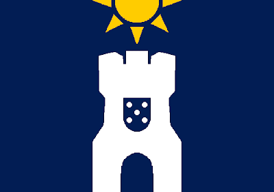
The white tower represents both Castelo Branco (the founder) and the Forte da Natividade ("Nativity Fort"), the initial mark of the city. It represents Belém, for example, in the coat of arms of the Marine Corps battalion settled on the city. The Portuguese inescutcheon was simplified to one of its elements: a single quina. The wavy blue fields represent the rivers, used as symbols of fertility and regional landmark, while the lilac field represent the aurora that appeared.

I think I could find at least one better arrangement:


Now the flag is resumed to the blue field, the white tower and the golden sun, that represents an amalgamation of symbolisms: the aurora, the equator, the climate, the fertility, the "tawny city".

This flag would be much better, in my opinion, if it was square, although Brazilian typical 7:10 ratio is sufficiently large.

Feel free to comment, your opinion is welcome.
I might post here again tomorrow, only if everything goes alright.

3 Apr 2013

Mirandese language (Portugal)

The Mirandese language (Mirandés) is a co-official language in Portugal (along with Portuguese). It's a language of Astur-Leonese group, spoken in good part of Miranda do Douro council, two parishes of Vimioso and one village of Mogadouro, with smaller influence on neighbor regions. I've seen many flags presented as proposals to this language (see examples there and there), so I thought about giving my own proposal.

To represent the Mirandese language, it's used the flag of the municipality of Miranda do Douro, sometimes used to represent the whole council:


A flag consisting in a banner of arms of the previous coat of arms could be misunderstood as a flag only centered on Miranda do Douro council, although the idea could be reused.

My proposal is the following:


I moved the Miranda do Douro arms to first canton (the position of honor), for being synonym to Mirandese language. The other three quarters represent the other regions where Mirandese is spoken, that are widely three: the two parishes of Vimioso and the village of Mogadouro. The blue cross fimbriated in white represents the first flag of Portugal, for the fact that the Mirandese is identified with Portugal.

Comments are very welcome! Feel free to comment.
Click here to access an interesting site about the Mirandese language.